March 2017
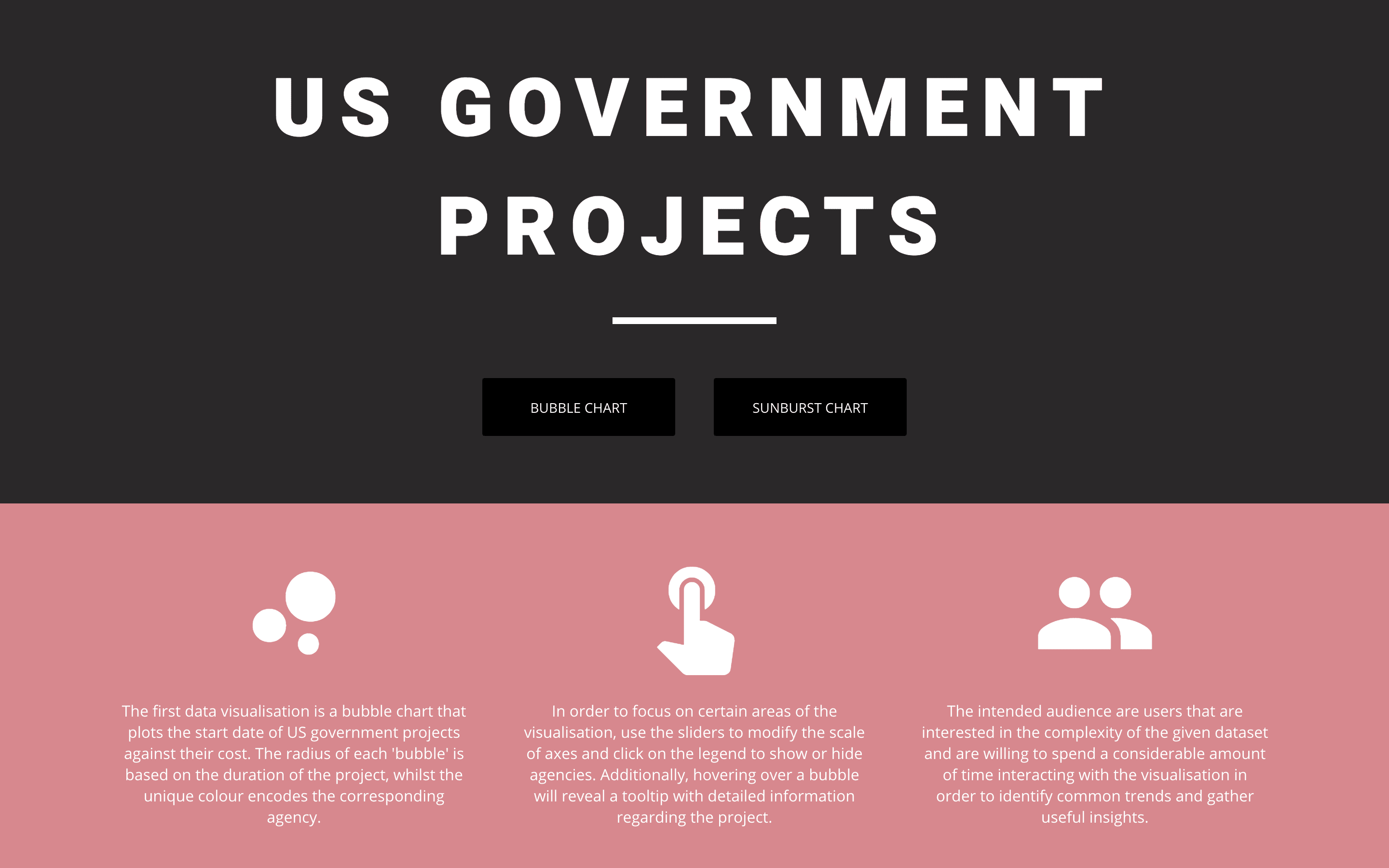
US Government
“This coursework requires you to take a provided dataset and create two of different and appropriate interactive web visualisations. You will be required to clean and perform simple manipulation upon the dataset to prepare it for visualising as well as fixing errors.”
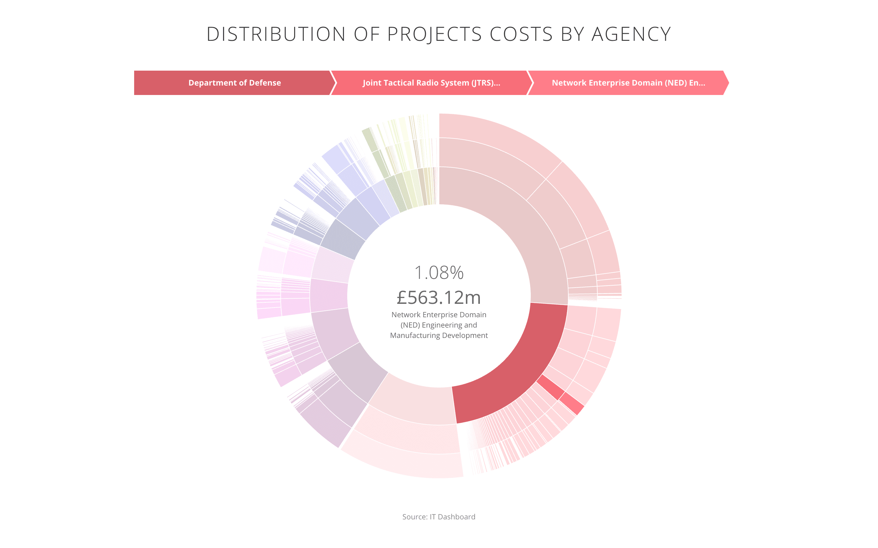
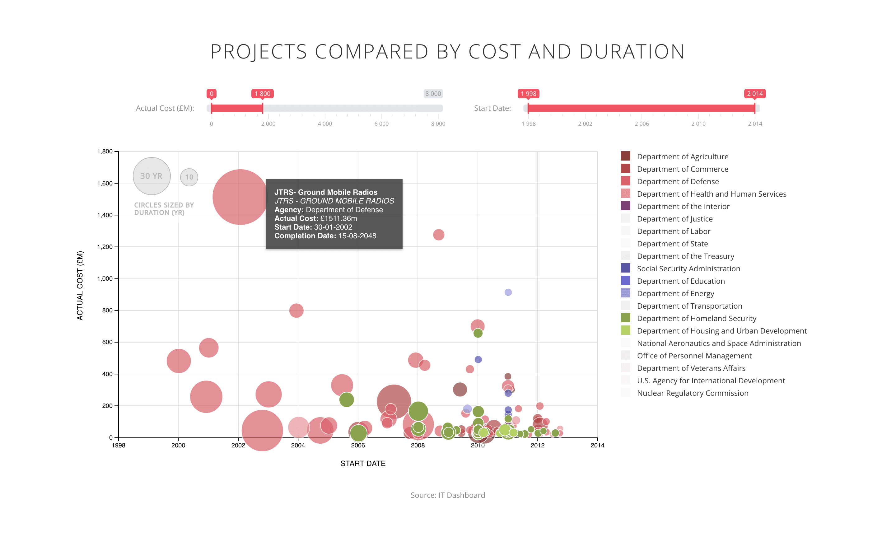
The first data visualisation is a bubble chart that plots the start date of US government projects against their cost. The radius of each ‘bubble’ is based on the duration of the project, whilst the unique colour encodes the corresponding agency. The second data visualisation is a sunburst chart which illustrates the hierarchies within the US government projects dataset, with each level corresponding to agency, investment title and project name respectively. The rings are sliced up and divided based on relative costs.